Links in body text should be underlined
Posted on December 8, 2023
Takeaways
- Links are interactive elements, and they should convey that fact clearly
- Links are the foundation of navigating on web pages, it should be easy to find them in text
- Since colour is not sufficient to distinguish an element state from another, it’s best to decorate elements when a state — in this case interactivity — must be conveyed. Adding an underline to links resolves that issue.
This article is part of a series on user interface micro interactions and how they affect the user experience.
Cet article est également disponible en français.
Browsers underline hypertext links by default. […] Users are accustomed to seeing links underlined. In body text, they may or may not be able to figure out which text is linked if the underline convention is not used.
Although users are accustomed to seeing links in the main content underlined, they are also accustomed to seeing tabs and main navigational features (oftentimes created as graphics rather than text) without underlining. In these cases, the linked items should be designed so it is apparent that the user can click on them to perform an action.
— “Links and Hypertext – Link Appearance – Underlining”, WebAIM
Links are the foundation of what the web is: text that is augmented by interactive links which allow users to jump to another text.
Many other elements can be activated — such as buttons or tabs — but those elements are usually designed to be obviously interactive.
When we say “links”, we also mean a hyperlink in the middle of a body of text. Since colour is not sufficient to indicate an element state, a decoration must be added to the element. Luckily, the hyperlinks are underlined by default on the web.
Thus, in a body of text, ensure that hyperlinks are underlined, so it is obvious for users which elements are available for interaction.
Bad Examples
1. No visual marker
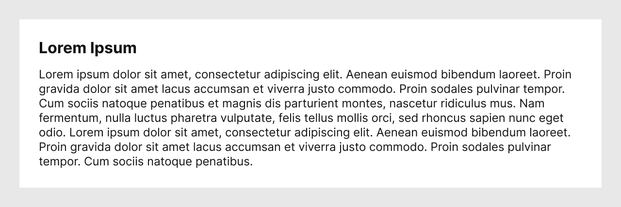
This is the worst example possible: nothing identifies links in the example above.
People looking at this design pattern may believe there is no way anyone would create such a design.
This deceptive pattern is unfortunately often used in legal text, especially in email footers — for example, when organizations are required to offer links to unsubscribe from a newsletter, but they would rather not make it visible to deter users from activating the link.
With no visual indicator whatsoever, it is unlikely that users would know there is something actionable in a block of text. It is either deceptive, because the Designer used a design pattern that is counter to usability, or badly designed, because it offers no affordance to users.
2. Only colour to identify links
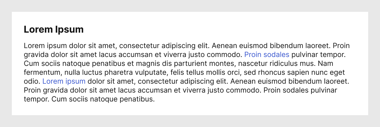
This example is seen often: only colour is used to mark a part of the text as an interactive component.
While Designers may have been careful to pick a colour that has a sufficient contrast with the background colour, it’s unlikely that the same colour would have a sufficient contrast with the rest of the body text colour at the same time.

If we desaturate the image seen above, we can see that finding the links has become almost impossible.
Using only colour does not work to mark a component as different than another. Doing so would also make the design inaccessible.
Good example
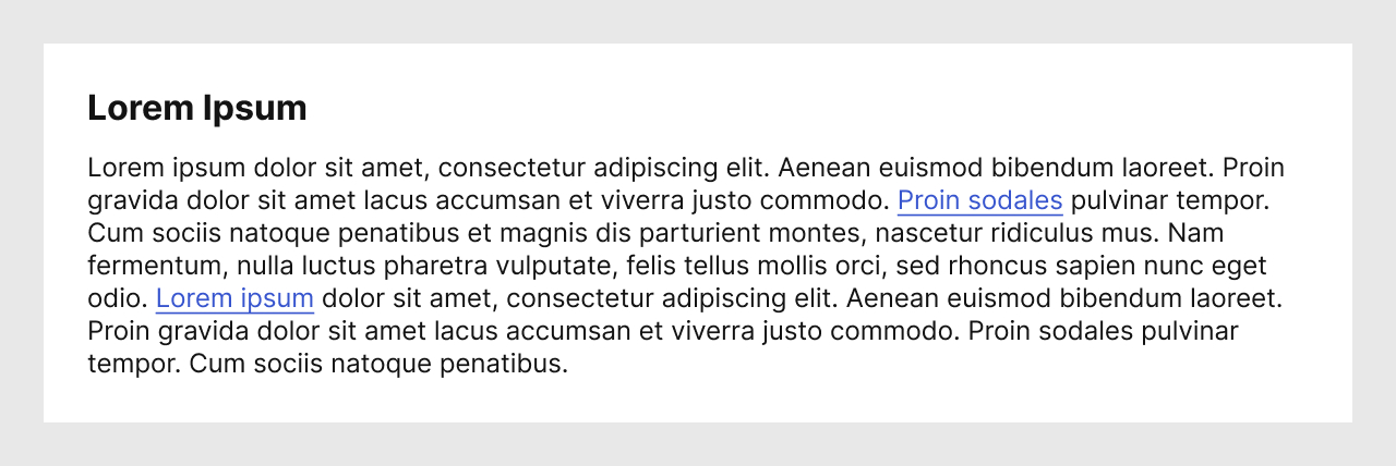
Finally, with this example, we can see that both colour and a decoration have been used to indicate that certain parts of the text are links.

Let’s desaturate this example as well. In this case, we can see that it’s still easy to find the links in the middle of the text.
Designers may want to use variations of the decoration — e.g. wavy lines, different thickness or colour for the underline, bold text — but ensure to test your design with actual users, especially those who may not have perfect vision.
Conclusion
I specifically mentioned links in texts, because they are in the middle of similar characters. While I prefer that all links on a website look alike, it may be much more obvious that some links are interactive — e.g., links in a header or a footer — even if they are not underlined. In those situations as well, ensure to test your designs with users, so as to avoid creating inaccessible designs.
Finally, ensure to design every state of the links, so as to ensure that they are not simply text which the author would want to emphasize with an underline.
References and Additional Readings
Ensure to design every interactive component’s states | Mat Janson Blanchet
How to make links accessible (Hint: colors are not enough) | Anna Monus – freeCodeCamp
Guidelines for Visualizing Links | Jakob Nielsen – Nielsen Norman Group
Links | Usability & Web Accessibility – Yale University
Making Accessible Links: 15 Golden Rules For Developers | Gian Wild – SitePoint
WCAG Success Criterion 1.4.1: Use of Color (Level A) | WCAG 2.1 Understanding Docs – W3C
Last updated on March 5, 2024