Every form element must have a label, whether it’s visible or not
Posted on December 4, 2023
Takeaways
- ⚠️ Missing form input labels is one of the most common accessibility issues on websites
- Labels are needed for screen-readers and other assistive devices to properly identify what form elements are about
- Designers should annotate their designs to ensure teammates and stakeholders know that work needs to be done, even if there is no visual effect
This article is part of a series on user interface micro interactions and how they affect the user experience.
Cet article est également disponible en français.
Whether we realize or not, much of what users do on a website is fill forms. But forms don’t have to look linear or to be full of boxes to tick.
Any time a user enters any data in a field, or makes a choice among a group of options, it is a form. As I defined in another article, forms are basically just an interface to gather user information and send it to another system.
Just like for buttons, screen reader users need appropriately labelled elements to be able to interact with forms. However, when designing forms with novel or creative layouts, that part often gets forgotten.
Let’s take a look at a few design patterns with form components to identify when those omissions occur, and how to improve those designs.
This article is a primer to the need to label form elements to the attention of content creators — Copywriters, Designers, Developers, and yes, Project Managers of all sorts.
See the “References and Additional Readings” section for links to in-depth articles.
Examples
Text inputs
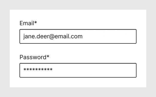
The humble text input, whether for regular visible text or for masked text for passwords, must have a label. Seen above is an example where both input fields have a visible label.
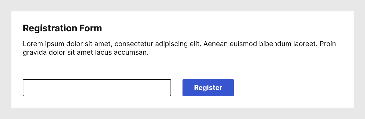
Seen above is an example that we encounter frequently: a form which contains a single input field, and a submit button. From the context and the paragraph, sighted users are able to deduce what they are expected to enter in that field.
Unlike sighted users, sight-impaired users and screen reader users do not necessarily read the content of a page linearly. Instead, they may navigate through a context-less list of landmarks and components. In such a navigation, the paragraph which helps sighted users is not related to the form.
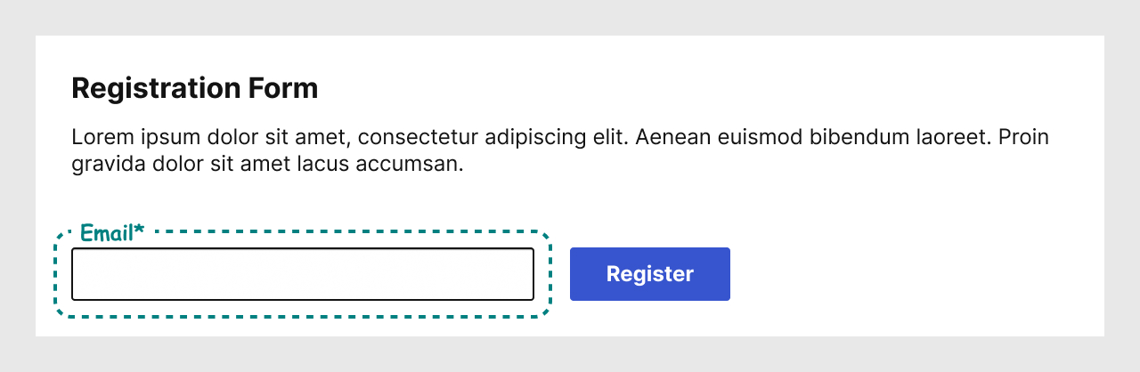
Screen reader users actually depend on the fact that each form element must be properly labelled in the code to understand their intent.
A good way for Designers to identify that a label may not be visible, but that it is still needed, is to add an annotation in their design. There are many ways and tools to do that, but how to do so is not the subject of this article.
Such annotations clearly communicates to Copywriters that they need to consider creating a label, and to Developers that the must ensure to implement the label in code. Having a visual record of this also helps Project Managers understand better that they must allocate time for that work to be done.
Radio button group
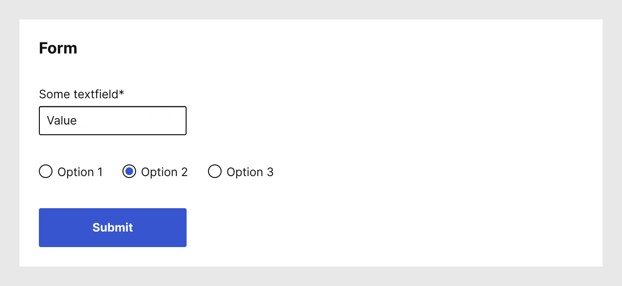
Radio button groups are usually well understood by sighted people, and may not always need a visible label.
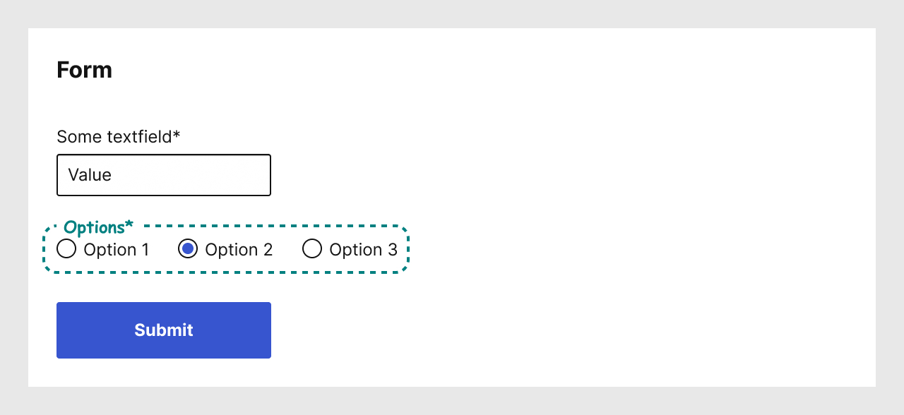
However, for accessibility these elements require a label. In fact a group of radio buttons is wrapped in what is called a <fieldset>. A <fieldset> has a label: it’s called a <legend>.
Same as for text fields, it’s best to identify them with annotations in the design.
Note that there is no such thing as a lone radio button, and thus the label always identifies the whole group.
Checkbox group

Checkboxes are very similar to radio buttons, they mostly differ in that where only one radio button can be selected at a time, multiple checkboxes may be selected at once.
Here also, the group needs a label, which is done the same way as radio button groups: with a <fieldset> and its <legend>.
A single checkbox is an acceptable design pattern. In that case, there is no need to use the <fieldset> and <legend> pattern, since the text of the checkbox is a label.
Select menus (a.k.a drop-down menus)
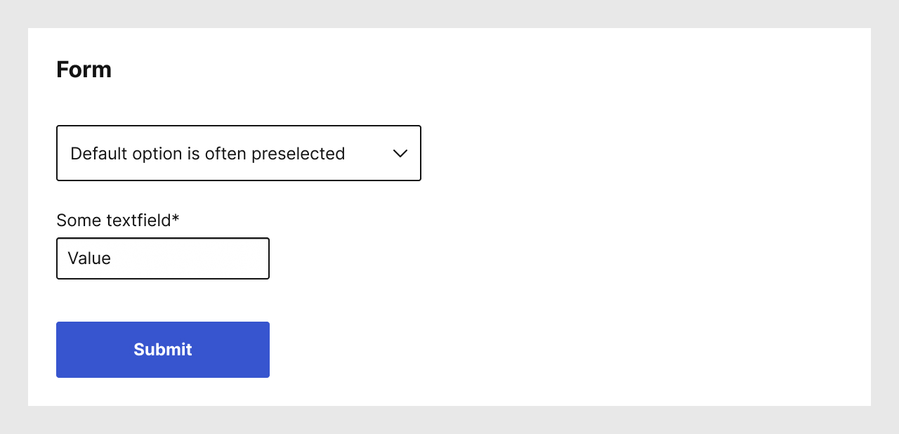
Using select menus, also known as drop-down menus or pull-down menus, is another design pattern which allows users to make a choice from a list of multiple options.
In certain cases, Designers have opted to use the first option of a select menu list instead of actually using a label. That design pattern can cause issues for users, as once a selection is made, they may not remember what the subject of the list was. This confusion is compounded for people who rely on assistive devices, because that design pattern would require them to go through the whole list if the menu has no label.
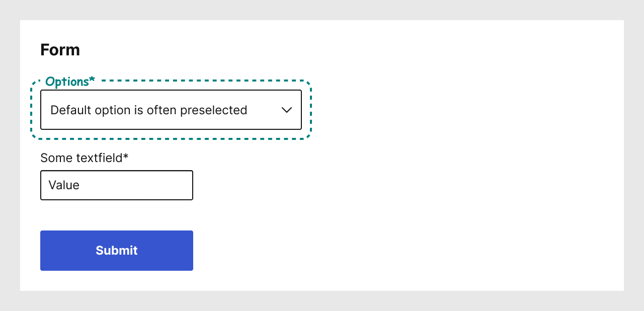
Save your users some confusion: ensure to annotate your designs and provide a label for the select menus in your forms, whether those labels are visible or not.
Other components may need labels as well
These few examples are not an exhaustive list, but they are the ones I have seen most often lacking a label in designs, copy decks, and code.
When using other components, or creating new ones for your designs, do read about what elements of accessibility need to be considered.
“Why should Designers do all this?”
When presenting best practices to teammates, it’s frequent to face resistance from Designers, Copywriters, or Developers, because those detailed design patterns may actually mean more work for them.
Designers should ensure to document their work with words as well, since design artifacts are just tools for them to communicate with their teammates, not self-evident truths to be passed down from an ivory tower.
“Can’t I use a placeholder instead?”
Placeholder text is a faded text inside a text field that is mean to provide a hint of what is expected in that text field. As soon as users set their focus on the text field, the placeholder text disappears, rendering it useless.
Additionally, screen readers cannot convert the placeholder text to labels.
That design pattern is a sighted Designer’s intent to distort a component to serve as another. There are many articles that argue to avoid placeholder text completely.
“I don’t know all these technical details”
Designers should not cop out of doing work because they do not know how to do something on the first try. The job of a Designer is not to decorate wireframes or websites, but rather to ensure people can interact properly with digital products.
Designers should welcome the opportunity to learn more details about the work they design.
“Can’t Developers do it?”
Many of the accessibility pitfalls that occur on a project could be avoided during the design phase(s) of a project. Simply dumping the responsibility on other teammates is another cop out that Designers should avoid.
As illustrated earlier in this article, design annotations ensure clarity of understanding for Developers, but also for Copywriters, and to a certain extent other stakeholders. If the work to be done is visible, more people will understand why things are not completed instantly.
References and Additional Readings
Articles
The Anatomy of Accessible Forms: The Problem with Placeholders | Raghavendra Satish Peri – Deque
Behind the scenes of creating a new Web Accessibility Annotation Kit | Jan Maarten – Medium
Checkboxes and radio buttons | Canada.ca design system – Government of Canada
Don’t Use The Placeholder Attribute | Eric Bailey – Smashing Magazine
Material Design Text Fields Are Badly Designed | Adam Silver – Smashing Magazine
Placeholders in Form Fields Are Harmful | Katie Sherwin – Nielsen Norman Group
Text fields & Forms design — UI components series | Taras Bakusevych – UX Collective
UI cheat sheet: radio buttons, checkboxes, and other selectors | Tess Gadd – UX Collective
Vertical Dropdown Menu – Design Patterns | UI Patterns
Why you should stop using placeholders in text boxes | Daniel Berryhill – UX Collective
Why Your Checkboxes Need to Have Label Tags – Forms | Anthony – UXMovement
Accessibility
The WebAIM Million – The 2023 report on the accessibility of the top 1,000,000 home pages | WebAIM
Creating Accessible Forms – Techniques | WebAIM
Understanding SC 2.4.6: Headings and Labels (Level AA) | WCAG Understanding Docs – W3C
Understanding SC 2.5.3: Label in Name (Level A) | WCAG Understanding Docs – W3C
Understanding SC 3.3.2: Labels or Instructions (Level A) | WCAG Understanding Docs – W3C
Technical Articles
How to structure a web form | MDN Web Docs
Landmarks Pattern | ARIA Authoring Practices Guide (APG) – W3C
<fieldset>: The Field Set element | MDN Web Docs
<form>: The Form element | MDN Web Docs
<input type="checkbox"> | MDN Web Docs
<input type="radio"> | MDN Web Docs
<label>: The Label element | MDN Web Docs
<legend>: The Field Set Legend element | MDN Web Docs
<select>: The HTML Select element | MDN Web Docs
Last updated on February 13, 2024