Ensure to use sufficient contrast
Posted on January 8, 2024
Takeaways
- ⚠️ Low contrast text is one of the most common accessibility issues on websites
- Consider appropriate contrast during the design phases: branding, design system documentation and when creating layouts
- Leverage tools to test colour combinations’ contrast during design and in context (e.g. in browser)
This article is part of a series on user interface micro interactions and how they affect the user experience.
Cet article est également disponible en français.
Text and interactive elements must be clearly identifiable as such. Elements that have a low contrast affect legibility and understanding.
Having good color contrast on your site benefits all your users, but it is particularly beneficial to users with certain types of color blindness and other similar conditions, who experience low contrast, and have trouble differentiating between similar colors.
— “Color contrast”, MDN Web Docs
Since the point of creating a website, an interactive installation, a video game or any other digital interface is likely to convey information and be useful to people, it stands to reason that colour should help make a digital interface usable, not the opposite. The MDN Web Docs sums it well (emphasis mine):
It is good to have a cool design on your website, but the design is worthless if your users can’t read your content.
Design should not only be decorating interfaces, it must support functionality. Let’s take a look at a few different ways to consider how colours affect usability, and what steps should be taken to use colour combinations appropriately.
This article is a primer to bring colour contrast to the attention of content creators — Copywriters, Designers, Developers, and yes, Project Managers of all sorts.
See the “References and Additional Readings” section for links to in-depth articles.
Ensure to create shades of the brand’s colours
When creating a brand identity and guidelines, it’s quite appropriate for Designers to select colours based on brand history and emotions they want to convey.
However, when it comes to usability, brand colours are not always ideal to use for interactive elements. Either the main brand colour can just never be sufficiently contrasted — orange and yellow are often problematic — or there are just too few colours to create proper combinations.
When presented with these issues, I have often been faced with Designers who start complaining that accessibility ruin their creativity and other such nonsense. I thought Designers reveled in solving issues? Also, wouldn’t it be an excellent moment to use colour theory to solve the issue?
In any case, my suggestion for that kind of challenge is quite simple: create shades for all the brand colours, and shades of grey as well. With that in hand, it should be much easier to find colour combinations that will be sufficiently contrasted.
Include colour contrast instructions in your design system
The Web Content Accessibility Guidelines (WCAG) provide guidance to ensure there is enough contrast between two colours.
However, my experience shows that no matter how many times that information is provided to Designers, contrast is rarely tested, and instead Designers tend to use their feelings to choose colour combinations. While their feelings might rely on their training and experience, those feelings still must be confronted with accessibility requirements.
Architects may want to create ethereal or surreal structures, but they still have to submit to gravity, fire codes, and yes, accessibility requirements such as ramps.
Instead of debating with Designers and to save everyone’s time, I suggest using tables in a project’s design system to clearly document what colours combinations are acceptable or not.
Afterwards, Designers can rely on these instructions when creating new layouts, and be fairly certain that the colour combinations they chose are accessible. Be certain to read a bit more in-depth articles about colour contrasts, as font weights and size may affect how elements are perceived to be sufficiently contrasted or not.
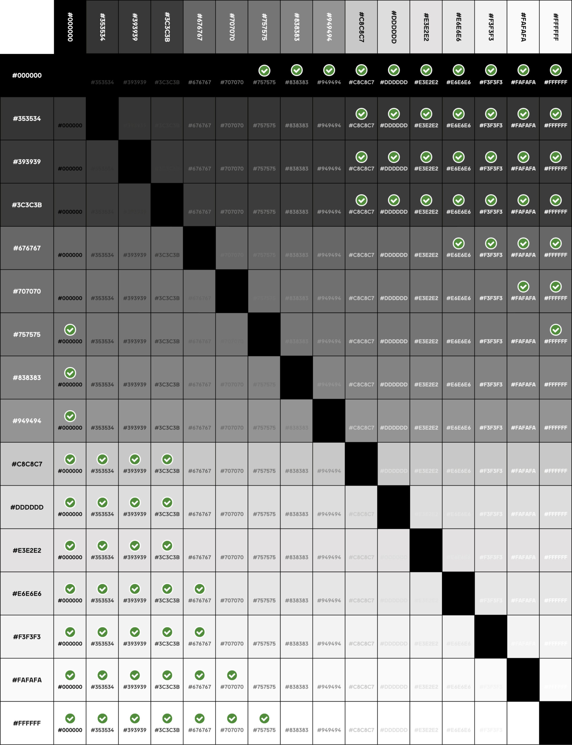
Ensure to test your designs and your published products
A while back, I created the Color Contrast Matrix, which allows to create a colour contrast table like the one shown in the section above. The idea was that it’s likely more useful to test multiple colours at once, rather than testing them two at a time with WebAIM’s Contrast Checker.
There is no lack of online tools that allow to compare colours, test combinations in-context, and ensure that they provide a sufficient contrast. Some can even test directly from the design tool or from the browser, seek them out.
With all that information and tools in hand, there is no reason to still design and publish digital products with insufficient contrast.
Concerned stakeholders
This job falls in the court of the people who are responsible for the branding:
- Graphic Designers
- Art Directors
- Creative Directors
Product Designers and UX Designers could also contribute to ensuring that colour contrasts are sufficient, but this is not their primary mission.
The corollary is that it is not the sole responsibility of developers to validate colour contrast. Just like their teammates, they can of course keep an eye open for insufficient contrasted colours.
A savvy Project Manager should ensure that his teammates have validated the colour contrasts used.
References and Additional Readings
Articles
The WebAIM Million – The 2023 report on the accessibility of the top 1,000,000 home pages | WebAIM
a11y tips: Disabled buttons and colour contrast | Sean Elliott – Medium
Accessibility Design 101: Color Contrast Considerations for UX Designers | – XD Ideas
Color Contrast Cheat Sheet: Guidelines for Text and Buttons | Vitaly Friedman – LinkedIn
Colors with Good Contrast | Web Accessibility Initiative (WAI) – W3C
Contrast and Color Accessibility – Understanding WCAG 2 Contrast and Color Requirements | WebAIM
Ensure to design a focus indicator for interactive elements| Mat Janson Blanchet
Orange You Accessible? A Mini Case Study on Color Ratio | Ericka O’Connor – Bounteous
Resolving Common Accessibility Errors – Low Contrast | Phil Fortier – Perficient
Trying to make yellow work | Molly Hellmuth – Twitter
Understanding SC 1.4.3: Contrast (Minimum) (Level AA) | W3C
Utilities
This list is obviously not exhaustive, use it as a starting point to find the tools you need for the context in which you work.
axe Browser Extensions for Accessibility Testing | Deque
Contrast Checker | Resources – WebAIM
Color Contrast Matrix | Mat Janson Blanchet
Last updated on February 29, 2024