Ensure to design all states for every interactive component
Posted on November 16, 2023
Takeaways
- Every interactive component has different states, it’s the job Designers to ensure each state has been considered and created
- The focused state is especially important for accessibility consideration, it is unfortunately too often forgotten
- Tip: place your component variants on a grid to see quickly which states are designed and which are missing
- Ensure to also declare which mouse cursor should be presented with each state
This article is part of a series on user interface micro interactions and how they affect the user experience.
Cet article est également disponible en français.
There are many ways with which users can interact with components : pass the cursor over, press, click, release, drag, scroll, etc. In order for users to understand which state the component is in, it must visually be presented differently according to each state available.
States
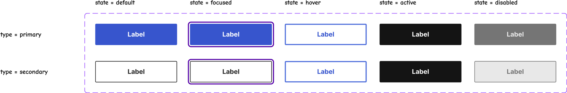
Below is the list of all the states which must be designed for each interactive component.
Default (or Idle)
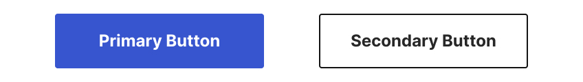
This is the state with which every component starts, the state which declares it’s there, and it’s available for interaction.
Focused
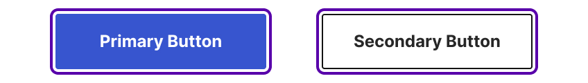
The focused state presents a focus indicator—also named a “focus ring”—which is a visible outline on the element with which the user is currently interacting.
This allows users to know where their cursor is located, or with which element they are currently interacting.
To meet accessibility requirements, every interactive element must have a focused state.
Hover (or MouseOver)
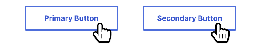
This is mostly a decorative state, which shows a reaction when users slide their cursor over the element, to signify it’s available for interaction.
However, if the user could not figure out the component was available for interaction without that state, this means the default state is flawed and did not communicate clearly its affordance.
Additionally, this state is not visible to users on mobile or to those navigating with the keyboard.
Active (or Pressed)
This state is very short lived: it is only visible when users are actively clicking/tapping on the component.
This is useful to signify that the interaction actually was successful, especially on touch screens, as they offer no haptic feedback upon tapping.
Disabled
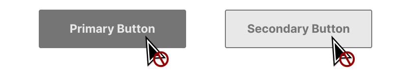
This state communicates that the component is not available for interaction. The cursor must also present that interaction is not available. This is especially needed in forms. Conversely, some other components may not require a disabled state.
If a component is disabled, it is best practice to present an explanation as of why to users, so they are not left guessing.
Tips for creating a UI kit
When creating elements for a UI kit, it is a good idea to place the component variants in a table, so that states (e.g. default, focused, hover, etc.) and types (e.g. primary, secondary, small, large) are clearly visible. See the image at the top of this article to see what I mean.
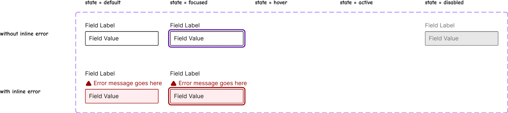
When placing images in such a table, it becomes easy to identify which states have not been designed. Also, some components may have additional states (e.g. dragging), or may be lacking states.
The image above shows input text fields. In this case, the hover and active states are not designed, because it was chosen that no style change should occur.
Be careful when choosing to not design a state, as this may lead to confusion for some users, because they may feel an element lack affordance. Remember that the focus state cannot be avoided.
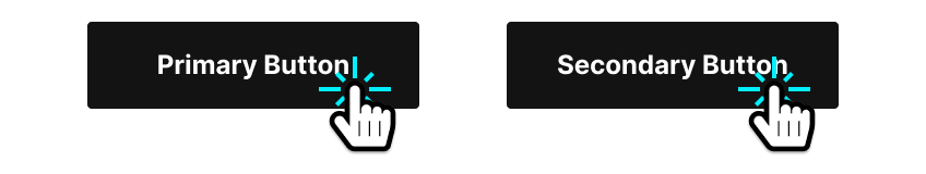
Ensure to explicitly declare the cursor associated with a state
Even though touch devices make up a huge portion of users, it’s still important to consider mouse interactions when designing. On devices that use a cursor—usually a mouse on a desktop computer—that cursor’s image changes according to what potential action users can perform.
“The cursor setting should inform users of the mouse operations that can be performed at the current location, including: text selection, activating help or context menus, copying content, resizing tables, and so on.”
— MDN Web Docs, “cursor”
It’s important that Designers and Developers implement the appropriate cursors, as they indicate the affordance of the elements over which the mouse is positioned.
“An affordance is what a user can do with an object based on the user’s capabilities.
[…]
An affordance is, in essence, an action possibility in the relation between user and an object.”
— Interaction Design Foundation, “Affordances”
Most of the times, it is simply a matter of documenting that the “pointer” cursor—the hand with the index finger extended—is used. For example, any element with which users can interact—buttons, links, radio buttons, checkboxes, etc.—must at least use the “pointer” cursor.
However, there are over 20 existing cursors native to all browsers that can be used, such as “wait”, “not-allowed”, “help”, etc. They allow to refine the indication of the type of interaction that users can perform on the element.
Ensure to look up the list and make good use of them.
References and Additional Readings
a11y tips: Disabled buttons and colour contrast | Sean Elliott – Medium
Active, Hover, and Focus States for Designers (paywalled) | Corak – UX Planet
Affordances | Interaction Design Foundation
Button States Explained – How to Design Them | UXPin
A Complete Guide to Links and Buttons | Chris Coyier – CSS-Tricks
The “Hover Effect” for Mobile Buttons | Anthony – UX Movement
Last updated on February 13, 2024