Buttons must have a label, whether it’s visible or not
Posted on November 27, 2023
Takeaways
- ⚠️ Empty buttons is one of the most common accessibility issues on websites
- Ensure each button has a label, even if that label is not visible
- Images in buttons are most likely decorative, ensure to identify them as such
This article is part of a series on user interface micro interactions and how they affect the user experience.
Cet article est également disponible en français.
Buttons are the most basic of components: an interactive element which users can activate to trigger a reaction.
In order to know what buttons do before activating them, users can see their label; a short text that should be clear enough to get the gist of the effect the button will have.
It can get more complicated when, for graphical design reasons, a button presents only an icon. There is this belief amongst Designers that an icon can be clear enough to do the same job as a label.
While that may be the case for sighted people — even if this is still a matter of some debate, since graphical communication is highly contextual and cultural — however it is not the case for everyone. Non-sighted and sight-impaired people rely on text read aloud by a screen reader to understand what the components are, and what they do.
Let’s take a look at a few variants of buttons and see how we can ensure they accessible in each context.
Examples
Example 1: buttons with text labels
This is the simplest case: the buttons show only a text label. Hopefully, the text conveys sufficient information for sighted users to understand what the buttons will do in the context in which they are presented.
Also, that text is what the screen reader will announce out loud, however, that is not necessarily sufficient to know the full effect. WCAG’s success criterion 3.2.2: On Input requires that buttons explain what they do ahead of interaction, so there may still be some additional work to do to meet accessibility requirements in this case. This requirement also applies to the following examples.
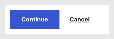
Example 2: buttons with an icon and a text label
In this case, buttons show an icon additional to their text label. This usually works out fine, since there is a text label on each of them.
However, if the icons have an alt text attribute added which reads, for example, “thumb up” and “cross” for the buttons seen above, the screen reader will announce “thumb up continue, button” and “cross cancel, button” when users set each button in focus.
This is not ideal, and it does not bring any additional useful information to users.
These icons are called “decorative images”. There is a W3C article on this subject to be able to distinguish what images are decorative and which aren’t.
When images are decorative, Designers should clearly indicate that these icons should not have the alt attribute, e.g.:
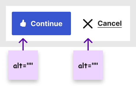
Adding these annotations ensure Developers will be informed to not add superfluous metadata to those icons.
The exact way to annotate a design may vary according to the tools used or the agreed workflow between Designers and Developers, but the idea is the same: clearly identify which images are decorative.
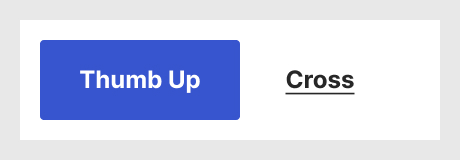
Example 3: Icon-only buttons
In certain designs, there may not be enough space to add a label, or the icon is indeed universally well known (e.g. the garbage can). As mentioned above, whether that is true and clear should probably be tested with users to avoid assumptions.
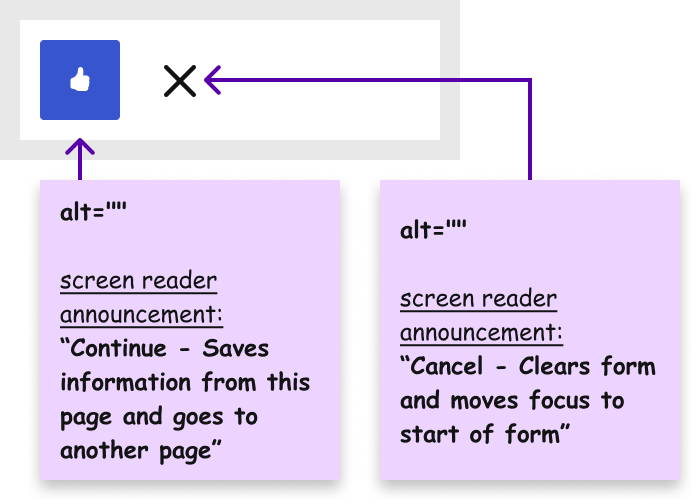
One may think that the alt text for these icons would be enough to replace the button label, but that is not the case. To screen reader users, this is what the screen reader would announce for those buttons as labels in such a case:
While not necessarily impossible to understand, it’s certainly not clear enough to provide a good user experience. Also, it adds a cognitive load on the shoulders of screen reader users to figure what those labels actually mean.
Here also, Designers must ensure to clarify that a specific label is necessary for the button, e.g.:
Concerned stakeholders
- Designers are responsible for identifying which elements require what kind of copy and communicate that to their teammates.
- Copywriters need to write or translate labels and screen reader announcements.
- Developers should pay attention when integrating buttons to make sure they’re using the right code for the labels.
Developers should also mention to their colleagues (Designers, Copywriters, Project Managers) when they are missing text for these labels.
Designers should not be responsible for the actual text of labels
Copy writing is a professional skill set on its own, and there are people who are responsible for designing the actual text for button labels and screen read announcements.
However, Designers are responsible for identifying which elements require what kind of copy and communicate that to their teammates, Copywriters and Developers, so that the intended design is known by all in the documentation.
References and Additional Readings
Articles
The WebAIM Million – The 2023 report on the accessibility of the top 1,000,000 home pages | WebAIM
Accessible Icon Buttons | Sara Soueidan
Behind the scenes of creating a new Web Accessibility Annotation Kit | Jan Maarten – Medium
Decorative Images | Images Tutorial – W3C
A Designer’s Guide to Documenting Accessibility & User Interactions | Stéphanie Walter
Minimize Cognitive Load to Maximize Usability | Kathryn Whitenton – Nielsen Norman Group
Pay extra attention to your buttons’ copies | Naimur Rahman – LinkedIn
Accessibility
Understanding SC 2.4.6: Headings and Labels (Level AA) | WCAG Understanding Docs – W3C
Understanding SC 2.5.3: Label in Name (Level A) | WCAG Understanding Docs – W3C
Understanding SC 3.2.2: On Input (Level A) | WCAG Understanding Docs – W3C
Understanding SC 3.3.2: Labels or Instructions (Level A) | WCAG Understanding Docs – W3C
Last updated on February 13, 2024