Avoid disabled components
Posted on November 18, 2023
Takeaways
To reduce potential confusion or cognitive load, avoid presenting disabled components. Instead, consider design patterns that do away with the components, or at worse, explain why they are disabled.
This article is part of a series on user interface micro interactions and how they affect the user experience.
“Why is the button to submit the form disabled? What must I do to be able to move forward?”
A user interface is, in a way, a conversation between a computer and a human. When we choose design patterns to design interfaces, we must ensure that our intent is clearly communicated to users.
In the case of a disabled button — or any other disabled component, really — users may be confused as of why that element is disabled, what must they do to enable it. In many cases, why is that element even presented to users? Why are we asking users to figure out the state of the application they are using?
Let’s take a look at some design patterns and find some alternatives to disabled elements.
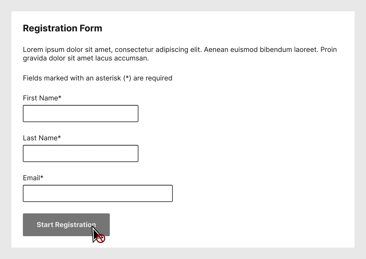
A design pattern we often encounter is the one seen above: users are presented with a form, but until they fill the form properly, they cannot submit the form.
This design pattern leads users to ask themselves the question at the top of this article: “Why is the button to submit the form disabled? What must I do to be able to move forward?” Many may reply that this is obvious, that users just have to read the instructions.
Granted, the example I present here is simple enough, but many forms — think if income taxes, insurance claims, any form from a domain of which you know little or nothing — may lead to confusion. Why not work a bit smarter, and ensure to not disable the component?
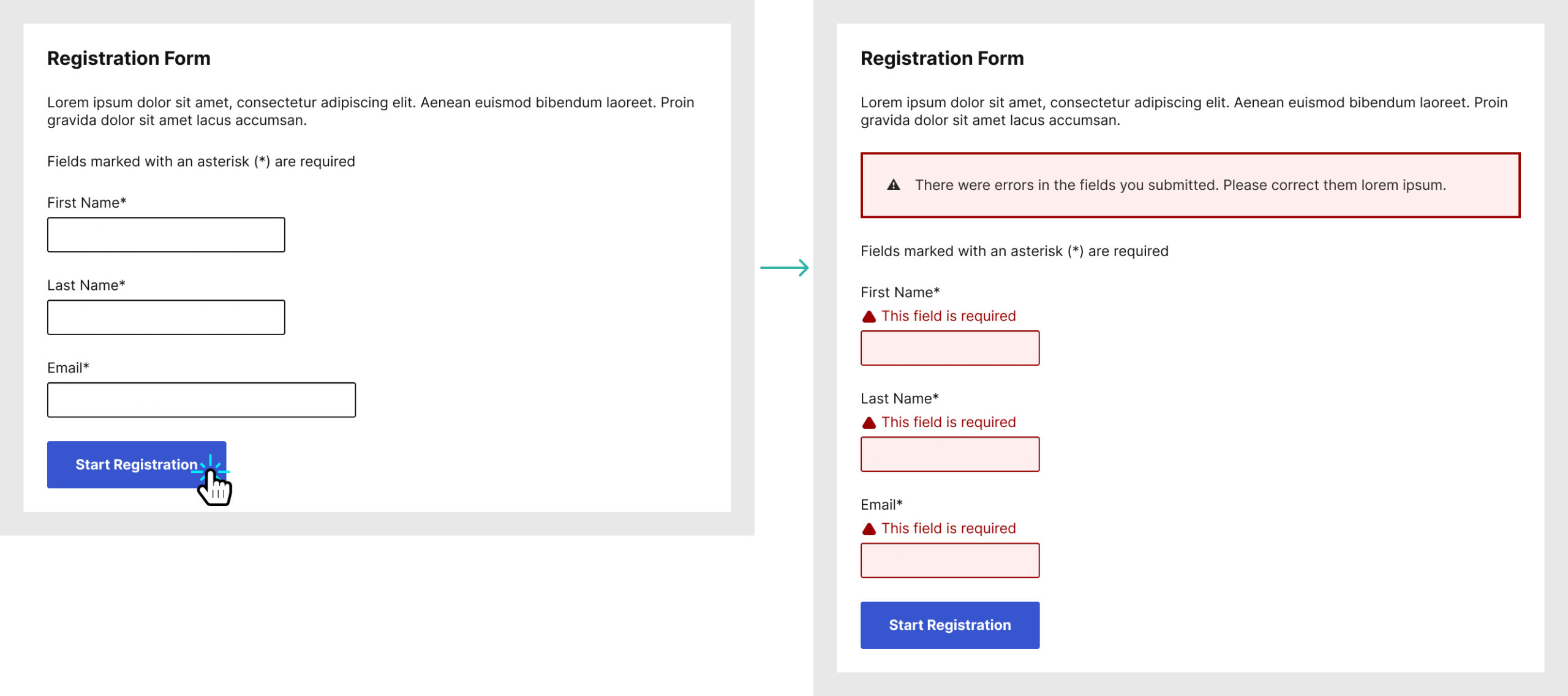
In this second example, users are presented with a form, and the submit button is available to submit. Yes, they may submit the forms with incomplete or incorrect data, but that is not a problem. Forms must be designed to handle erroneous inputs, whether it is done with inline errors, or with errors presented after the form is submitted. If a user submits incorrect values, those error messages should provide sufficient information to guide users as to what they should do.
Sometimes, Designers, Developers, and even stakeholders are adamant about ensuring to present the button in a disabled state. When this requirement is present, I always insist that a clear textual expanation must accompany the disabled component, so that users may know what to do, if they can even do anything.
Adding an explanation does make sense when you explain it to people, however they oftentimes realize this means additional work — design, copy, translation, development, etc. From that point, they understand the need for a simpler solution.
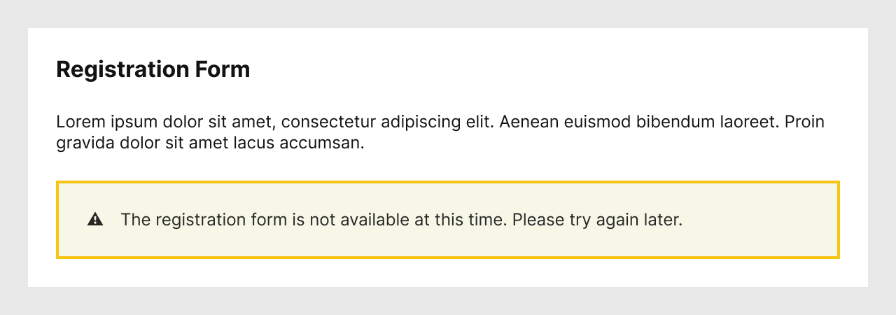
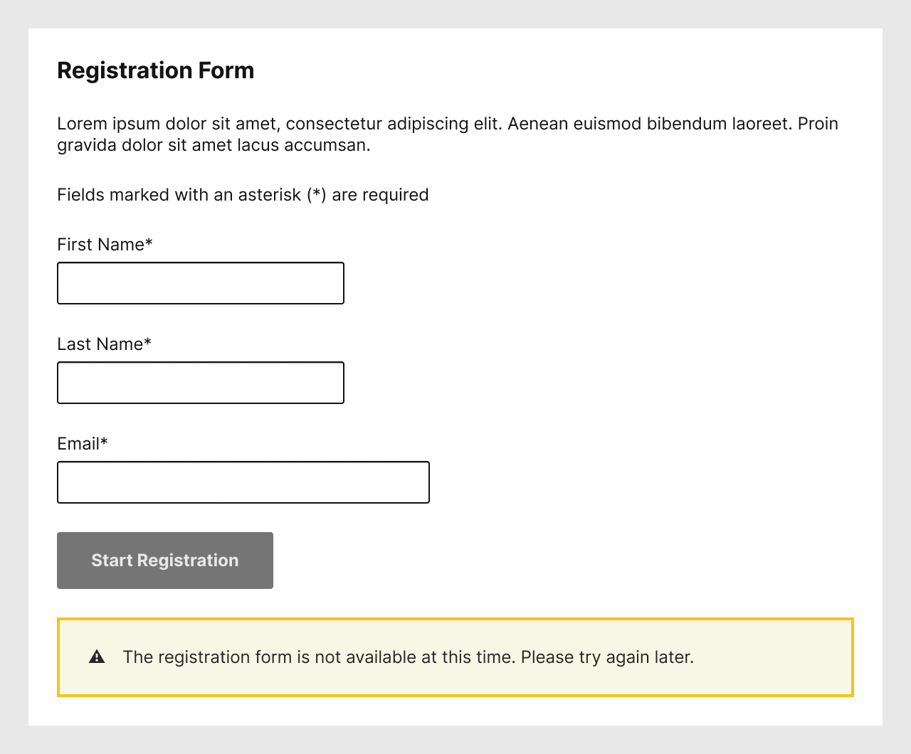
Continuing with the example of a registration form, if it is not available, we could simply remove the whole section.
In this example, the explanation is still presented to users for the lack of a form, but that may not always be necessary. “Add to cart”, “Print”, or other call to actions require specific conditions. If those conditions are not present, why tease users with a functionality with which they cannot interact?
There is no clear “do” or “don’t” for this design pattern. Consider avoiding presenting disabled components to users to reduce their potential confusion.
References and Additional Readings
Disabled Buttons UX | Vitaly Friedman – Smart Interface Design Patterns
Don’t Disable Form Controls | Adrian Roselli
Hiding vs. disabling interactive elements UX pattern | Folio Project
UI Design Patterns – How To Handle Disabled Components | Michelle Mac
Usable and Accessible Form Validation and Error Recovery | WebAim
When is it appropriate to use disabled inputs? | User Experience – Stack Exchange
Note that the inclusion of articles in this list does not necessarily mean an endorsement. These articles are listed to help further your thoughts on the subject of this article.
Last updated on February 29, 2024